

Leitu Bonnici

SummaryLeitu Bonnici is a graphic designer, filmmaker and artist that has lived and worked across Bunurong Boonwurrung, Wurundjeri Woiwurrung, Guringai, Dhurag and Kaurna Countries, but is currently based in Arnhem, Netherlands. She is of Sāmoan (Faleasi’u), Italian, Maltese, Irish, English and Swedish ancestry (among others).
Through a wide range of methods in the intersections of visual art, graphic design, film, wearables, objects, experiences and more, her work challenges the entrenched frameworks that dictate the recording and distribution of information. She runs Le Phem Era, an interdisciplinary and anti-disciplinary practice that critically examines ephemera through experimental forms of archiving and publishing. Research is conducted through creative analysis, datafication, disruption, re-assemblage and speculation using democratic modes of production.
Creative Process
The Fale-ship Residency Programme was the means to start a project that I have wanted to do for some time. Developing a typeface is a process that usually takes years, so having to create even a first iteration in two weeks is a huge challenge. The short time frame forced a new approach that did not allow for agonising over details, instead leaving spontaneity and intuition to dictate creative decisions.
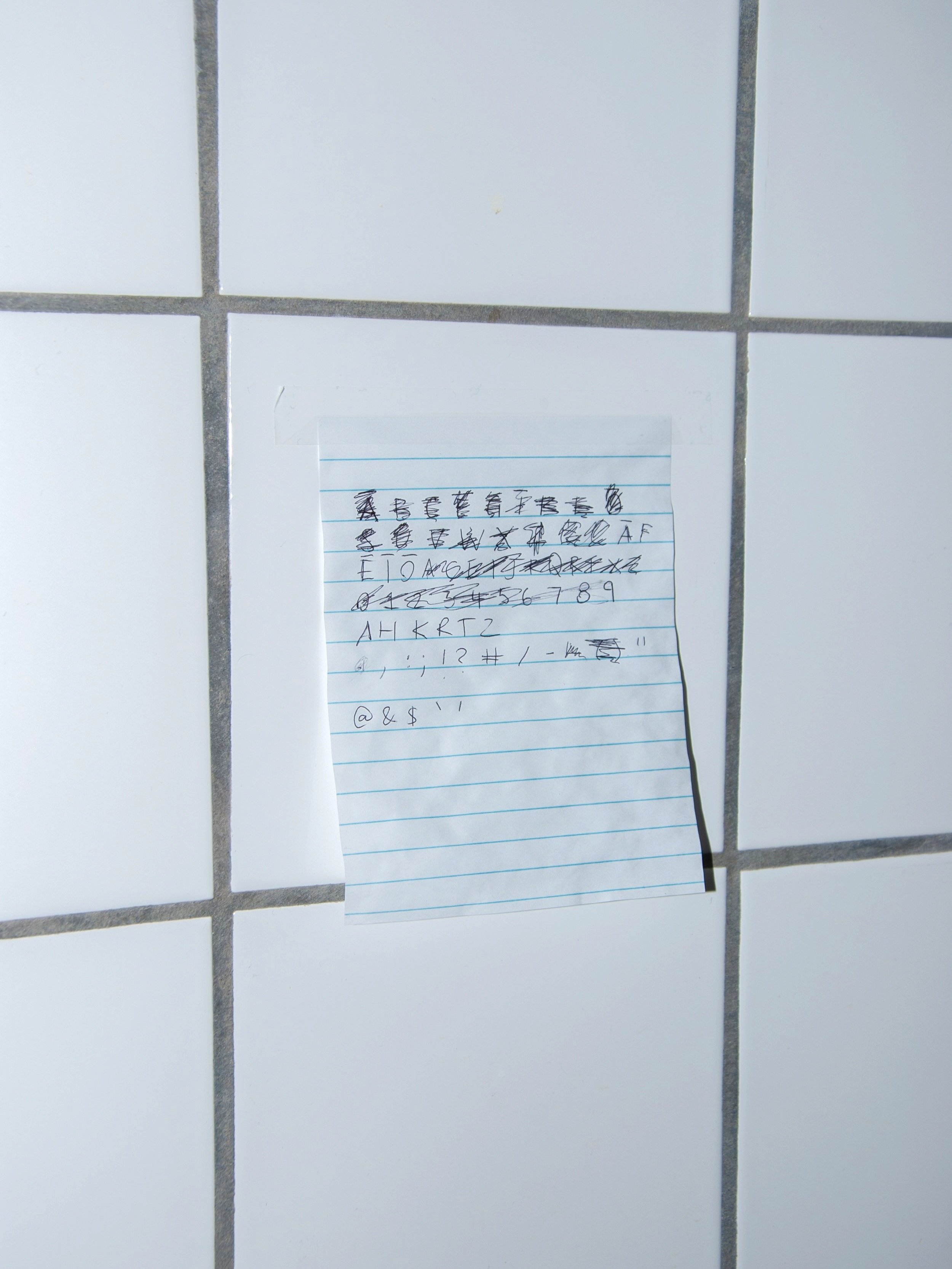
The typeface I developed during this residency expresses my personal connection to my Sāmoan heritage by using parts of myself, placing a physical memory into the work. The process started with collecting strands of my own hair and using them to sketch individual letters. The easiest place to draw with hair turned out to be in the shower. Even when wet, the shapes were formed just as much by chance, as by design. Individual letterforms were photographed, imported into Glyphs (a font editing software), and drawn over.
In order to create a cohesive series of letterforms, many of the characters were redrawn and rephotographed. The outlines of the final sketches were adjusted through minor exaggeration or simplification. Deciding to focus on concept, rather than legibility, a negative spacing was given to all the letters, meaning there was overlap that creates a connection between neighbouring letters, as well as more closely resembling hair as whole words.


Creative Workspace
I am glad to have had the opportunity to develop this work in the comfort of my own space outside of the influence of institutions, where existing typographic conventions are reproduced and where I will be spending the next two years.

Final Works
Gagana Sāmoa uses characters from the Latin alphabet despite no cultural or historical connection. The aim of this project was to turn the imperial tool against itself, highlighting histories and perspectives that are missing from the frameworks that we are all forced to work within. This challenge to Eurocentrism is an act of subversion, but I fear that it also legitimises the system by trying to reform it. Assimilation into European methods of communication erases knowledge and identity in the process. Throughout Fale-ship I found myself constantly fighting against conventions that we have been taught is the right or only way to do things, and feel that I did not always succeed in resisting.


Fale-ship Questionnaire
What is inspiring you right now?
I find it inspiring to see all the great work that Oceania Peoples and other Indigenous Peoples from around the world have done and are doing, particularly those who connect to ways of knowing from ancient times, recontextualise them and make them their own. I hope to continue to see lived experiences by Oceanic creative practitioners be valued as knowledge and have an effect on broader discourse in a way that can create positive change for all.
Latest News


